Thoughts on Cinematography and Lighting in “Search: WWW”
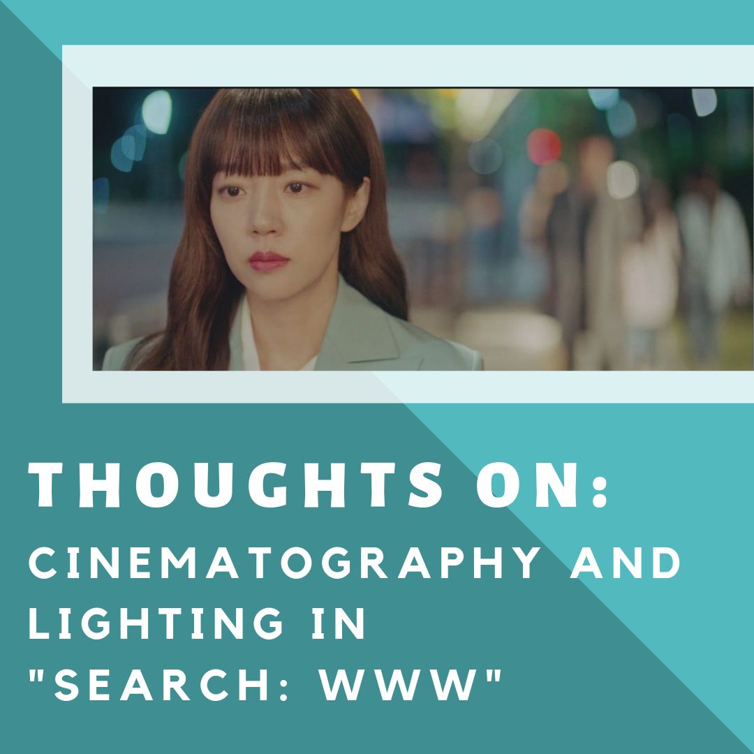
The final episode of “Search: WWW” airs today, and I have loved the drama so far. I like the relationships, the friendships, the couples, and the strong female characters. Did I mention the STRONG female characters? I have to admit though, as I have been watching the drama, something has really stood out for me, and I want to point it out…To see if anyone else has noticed it or not. Let’s take a closer look at “Search: WWW’s” cinematography and lighting.
Disclosure: This post contains an affiliate link. Purchases made through this link help us to keep running and are much appreciated. Thank you!
The Cinematography
Now I have seen many KDramas, and there have been MANY memorable scenes and dramas that I have recognized as having fantastic cinematography and camera movement, but there is just SOMETHING different and very noticeable about Search: WWW. I have found myself hunting through the episodes and scenes, seeing what I can find, and what I am interpreting from those choices in cinematography and lighting. This has made the drama enjoyable for me because I am looking for the artistic side of the drama and examining the choices that were done by the behind-the-scenes team.

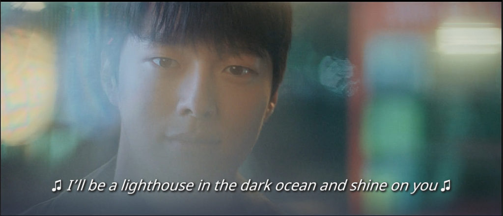
The choice in camera shots and camera placement was the first thing that I noticed while watching the drama. The camera becomes blurry and unfocussed except on an actor’s face or an area that the drama wants to pull the audiences’ attention to.
Now I have seen this done before in a drama but it has been to show how an actor is feeling after getting seriously injured and bleeding out (out of focus and not connected with what is happening around them.) I don’t recall it being used to emphasize an action or the expression/reaction on an actor’s face. What I am used to seeing when it comes to dramatic effect in KDramas is slow motion, which we still see in Search: WWW. But even that has been unique because the drama will still use slow motion but speed up the surroundings or make them unfocused to again add more emphasis to a certain subject.

The camera placement and angles in some episodes and shots have been unique to me as well. You can be watching a scene and all of a sudden it will shift into a diagonal angle…again to signify a reaction to what another character has said.
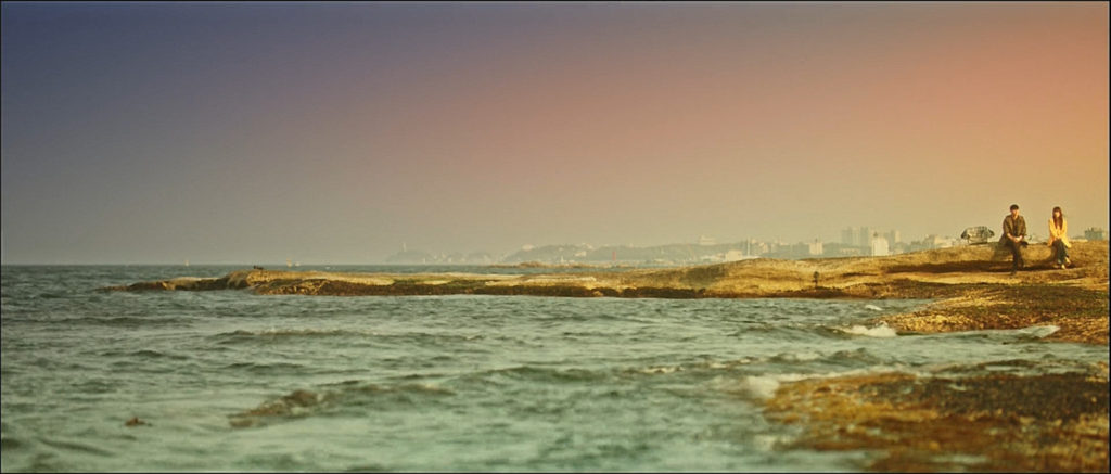
Also, the wide shots in this drama are just DOWN RIGHT GORGEOUS! Between the memorable scene of Park Mo Geon and Bae Ta Mi facing each other, standing on opposite sides of the screen with the cherry blossoms around them, to the couple at the beach where, in one wide-angle shot, it shows the ocean and then puts the couple together, on the right-hand side of the screen on a rock. Just breathtaking.
I think the wide shots also have another meaning behind them (specifically, talking about the relationship of Park Mo Geon and Bae Ta Mi). The distance in the wide shots between the two characters described where the couple is in their relationship. The further apart they are in the wide shot signifies that Bae Ta Mi hasn’t accepted Park Mo Geon into her life and is trying to keep him at a distance. The camera placement and actor placement in the wide shots are used cleverly to show this aspect of their relationship.

The Lighting
Speaking of couples, let’s move on to the next major point I want to make about this drama and one I have loved noticing and picking up on. That is the use of lighting in this KDrama. Whoever is doing the lighting in “Search: WWW” deserves an award because I think there is a deeper meaning and strategy when it comes to the drama’s lighting. Now I could be completely wrong on this but I have noticed that with each of the 3 major couples in the drama there are “lighting” themes. I THINK THAT IS JUST BRILLIANT because it gives a deeper meaning to each relationship and really allows the audience to connect more with the relationships in the drama.
Bae Ta Mi & Park Mo Geon
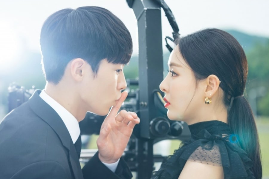
The major colors in lighting that are associated with this couple are yellow and warm hues like brown. The scenes with them always give off feelings of warmth and comfort because of this. I interpret this shows how the couple will and does get comfortable with each other. Growing to be a comfort for each other and someone they can depend on in their personal and professional lives. This couple seems to have what I call a “sunshine” glow about them. While it is isn’t new to KDramas to use a bright light behind an actor in scenes where the female lead is admiring him for being so handsome, Search WWW also uses it when Park Mo Geon is admiring Bae Ta Mi…Not just for her looks but when she gives off a strong persona or says something smart. This showcases again their mutual respect for each other.

Song Ha Kyung & Oh Jin Woo
Now, this couple is the opposite. Any time there is a scene with this couple, the prominent colors that are projected are blues and purples. What I find most fascinating about their lighting is that there still is a yellow light but it seems cold and washed out. I think this signifies that at least one person in the relationship still cares for the other or maybe even both of them do but the couple has been together for so long that the love and affection have faded and maybe even disappeared for one of them. The blues and purples support the coolness of the relationship but also, I think the shade of color shows that the couple still respects each other because the shades seem regal and deep in color.

Cha Hyun/Seol Ji Hwan
This couple has a lot of white or whitish lights in their scenes together. I think this symbolizes how new the relationship is. The couple is still trying to get to know each other and don’t know how they feel about each other. A lot of times white signifies pureness or innocence, and I think that is the idea behind the white hues given to this couple. Or maybe it just means that they are in the scenes/places that have a lot of white lights such as a hospital or drama set (just kidding!) The whiter tones in these couple scenes are a major contrast to the other two couples in this show because they are almost void of color since white is the prominent tone.

Barro VS Unicon
Lastly, another prominent relationship that we have in “Search: WWW” is the relationship between the two companies. This is even supported by the lighting. Scenes at Barro are warmly lit with yellows and browns while scenes at Unicon have a lot of blues and dark colors or are just void of color. The two companies are polar opposites and rivals, even in the lighting. When an employee of Barro and an employee of Unicon are in the same shot, the scene takes on more blues and purples to show the tension between the companies and sometimes even the characters who are in the scene (such as scenes with Bae Ta Mi and Song Ha Kyung.) These scenes always have a darker hue and the production brings in blues and purples to symbolize the rivalry.

Why don’t you go check out the drama yourself and see if you have the same observations that I did while watching?
Did you notice the camera shots and choice of an unfocused camera? Did you notice any new light concepts that I didn’t catch? What did you think of the cinematography and lighting in “Search: WWW?” We would love to hear what you saw or what you think. Have you enjoyed watching?
Love “Search: WWW?” Be sure to check out TeaRexDramaMama’s recaps!


3 Comments
yoonmipins
Having seen the pictures from the scenes again, I can see what they are trying to do!
There is another part of the cinematography that takes place in their 14th episode to emphasize one of the three leads’ relationships, which I won’t spoil.
To anyone who has seen the 14th Episode of Search: WWW, you might know what I’m talking about.
Caitlin
Thank you YOONMIPINS! I am glad that you liked the article 🙂 Once I developed this theory with the lighting for the couples, it was fun watching the episodes to see if my theory played out…I am currently watching episode 14 now so I am curious to see if I can guess what part of the cinematography you are referring too!
Drea
Love the way you focus on the lighting in the scenes and the symbolism behind it!!